Your business needs an update, and you want to take it further. You see scope in the digital world for your business & want to go for it.
More customers, extensive reach, Increasing sales, and profitable business. That’s it. Done
This seems straightforward.
Is it so?
Not all businesses that shifted to websites are performing well.
Statistics showed that 57% of businesses do not survive on websites even after much effort. You definitely don’t want to be the one.
Now, if you have decided that your business success does depend on a custom website, how can you achieve it? You need some effective web design tips.
We are sharing the 5 web design tips for a specialized, customer-friendly & effective website.
Web Design Tips for an Effective Site
- Clear Purpose
- Content
- Design and Graphics
- Active & Functional
- Ensure your Site is Easy to Navigate
01. Clear Purpose
· Design with Visual Hierarchy in Mind
Before moving further, think about the purpose of your website. That is sales, of course, but visitors want to know more about it. Why did you start it? The cause linked with your business; how do you see it benefiting people?
One of the most responsive web design tips is to include your website’s road map. For example, if a customer enters your website, how do you want him to see your business? Most of the time, the website is the only thing your customers see.
Make a road map first.
Align your content so that anyone who visits the website does not get bored or confused.
DON’T CONFUSE PEOPLE!!!
That’s one of the worst mistakes business owners make.
Confusion = Chaos = Indecisiveness
Confusion creates chaos, and chaotic people cannot make a decision. No leads! No sales! Story ends.
02. Content
· Create Easy-to-Read Website Content
As you may have heard, Content is king. That’s right! But not every Content.
One of the responsive web design tips and tricks lies in the content. The content on your website must be “concise, to the point, beautifully crafted & authentic.”
- Do talk about everything but in separate sections.
For example,
- The services section must include the details of services, not more or less.
- There should be a separate section for your future foresight.
- Do not mess things up. It confuses the person, and the confused person yields the result mentioned above.
- Refrain from using heavy sentences with not-so-common understanding. Every person who comes to your website is not a native speaker. Linguistics must be catchy but straightforward.
- Avoid irregular & unnecessary details in a single paragraph.
- Keep your homepage minimalistic and free of clutter.
03. Design and Graphics
· Font
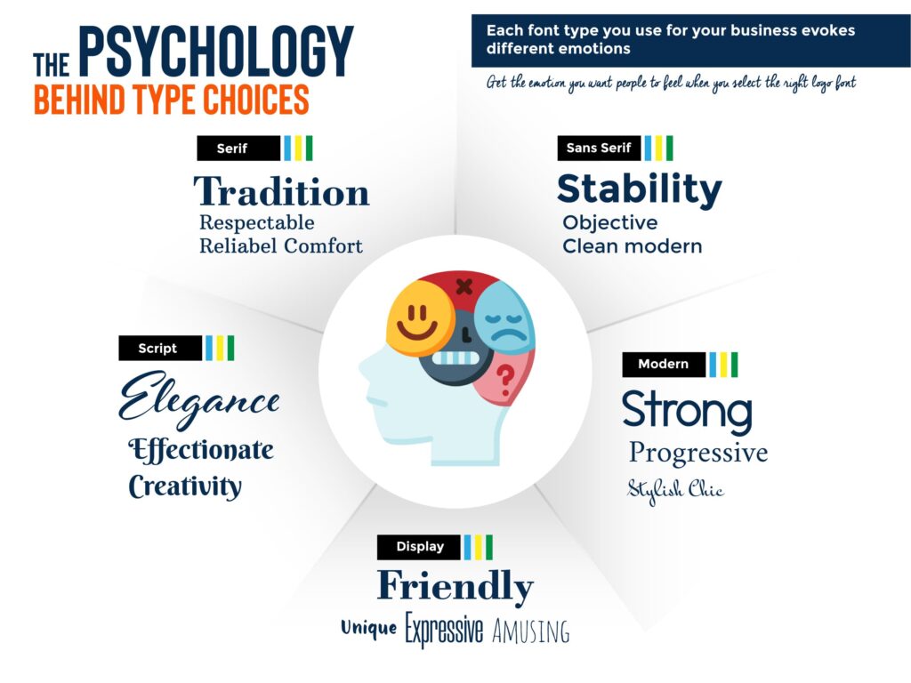
The font is significant when you are choosing one for your website. Let us share font psychology with you. The choice is yours.
· Images
Imagery is vital to a website, yet most people do it wrong. Imagine you visit a website with poor design; what did you think at first? The design and graphics are the first things that catch the attention in the first few seconds.
Images can trigger emotions, create trust & connection, change mood & enable the person to get your message. With The proper compelling photos, you can generate leads up to 2.5x.
What significant points to keep in mind while doing so,
Use High-Resolution Images.
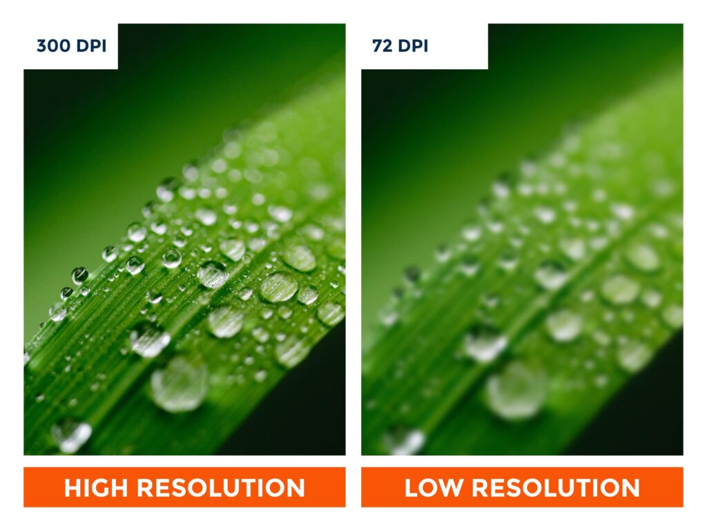
Resolution is important. The low resolution does not inspire a person, no matter how beautiful your image is designed.
· Text Themes
Remember to pay attention to your color theme & design. Go with the flow, create that beautiful space with your brand theme, and inspire the visitor.
04. Active & Functional
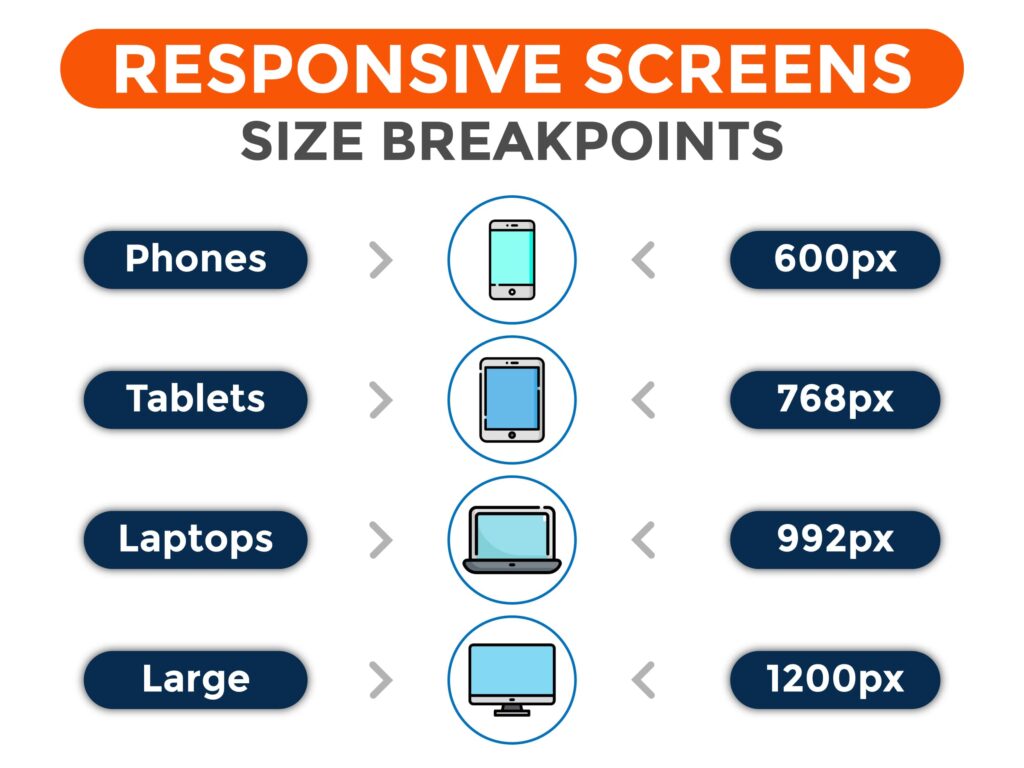
This is an essential technical point to be kept in mind. Let’s discuss a few effective website design tips to increase the functionality of your website.
- Websites should be active and functional; broken links or non-respondent buttons negatively affect visitors.
- You should not leave a button or link unattended. Every section and the social link must be completed before you share your website live.
- Proper functional numbers, emails, & social links should be provided.
- Websites must be swiftly responding irrespective of the number of users approaching them.
- Stay Mobile-Friendly: Layout must be personalized to display on all devices, including mobiles.
05. Ensure your Site is Easy to Navigate
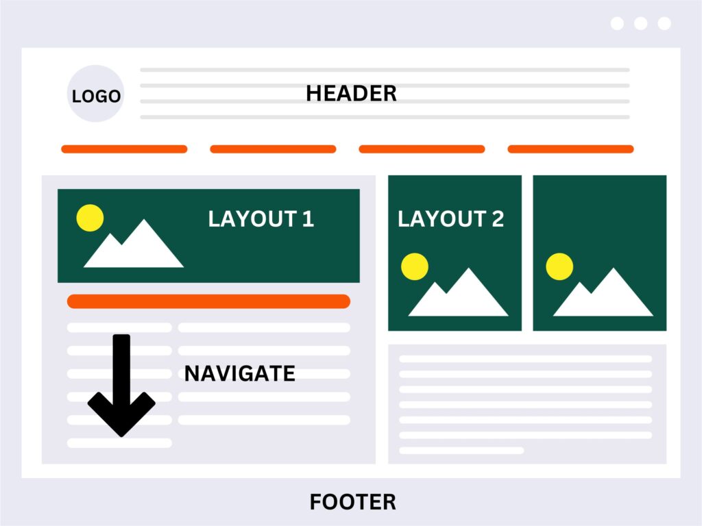
- Keep the Logo at the Top: Your logo is the first identity of your brand. A creative and meaningful logo is highly recommended for your website design.
- Navigate Accurately: If your website is a one-pager, the user will need a long scroll to go through the details. In such cases, go for a template with an anchor menu. The anchor menu allows the user to return to the top with one click. Add the “BACK TO TOP” button.
- Footer is Essential: Place important links in your footer, including “Privacy policy, terms, and conditions, blogs, etc.”. Also, add quick links to your contact information and social media redirecting links that are “working.”
These decisions are challenging ones. Taking your time and doing proper research can pay off in cost, quality, and, more importantly, peace of mind.
If you want to ease this pain, we are here to help you.
Reach us to develop your website or online consultancy (Free) at WhatsApp (+1 647-725-9693).

